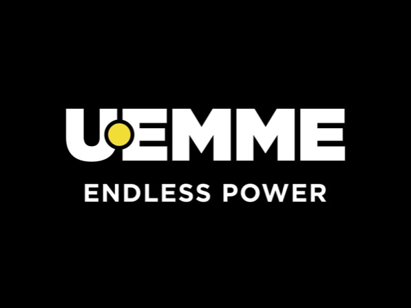
THE RENEWED UEMME’S LOOK STARTS FROM THE NEW LOGO

A brave and well-considered choice made by our company, which decides to be the protagonist of a rebranding process starting from the launch of the new logo.
The desire for a graphic change and to spread a renewed face of the brand comes from the idea of strengthening the heritage of ideas and experiences to communicate our roots in a new key.
Let’s start from the restyling of the old logo with a revolution of the graphic traits towards a new image, which aims to cross national borders for a total understanding of the same all over the world.
With an innovative character, the new brand aims to enhance the concept of “attachment” through the introduction of a yellow dot, a color in contrast to black, placed in a central position.
The position takes on a precise meaning, aimed at evoking the image of a pin, a highly representative element because it is present on almost all of our products and characterizes their operational functionality.
A clear and simple element, but with a strong, energetic and contemporary communicative power.
We have modified the style of the original font and replaced it with an impactful and more modern one, capable of communicating the idea of strength, toughness and technology on which our conceptual vision is based.
With these new perspectives, we strengthen our mission in order to continue to create high-performance, quality and professional equipment to extend the working capacity of each host-machine.


